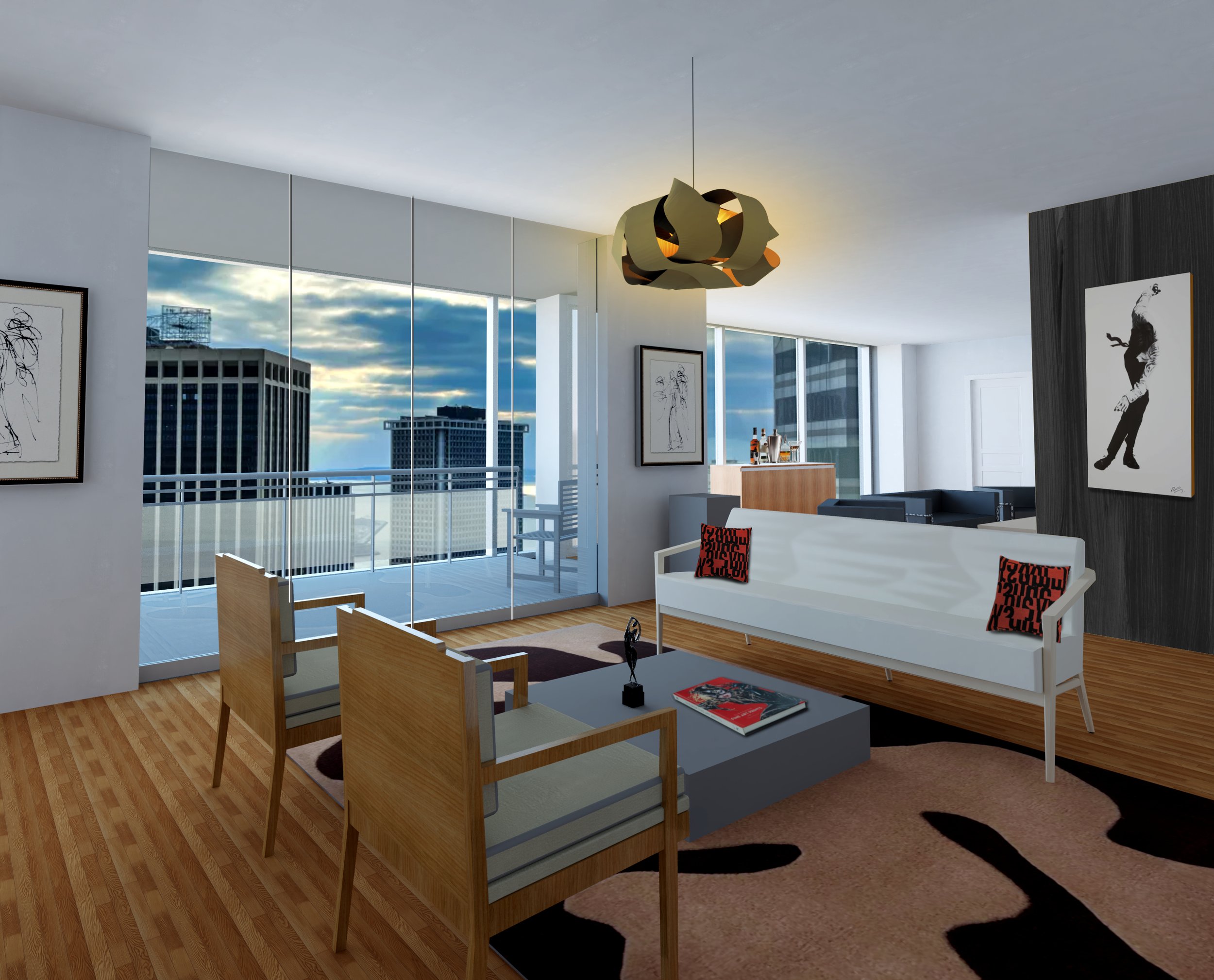
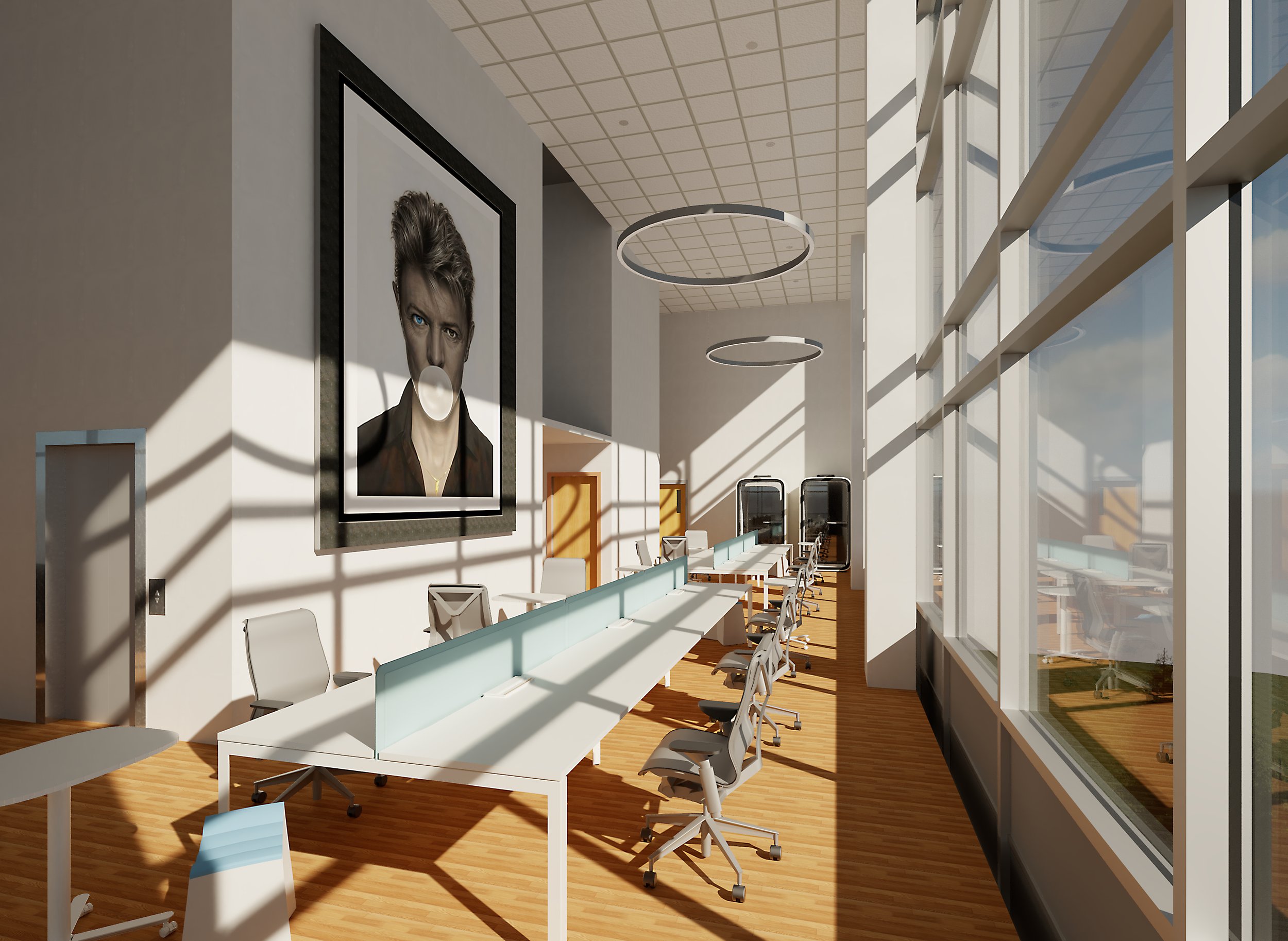
Mid-Century Modern: 2021-2024
This series was inspired by my desire to try something new – a really different direction for the work. I’ve always been a fan of the Mid-Century aesthetic and found some fantastic inspiration in a 1962 book from my mother’s library: The Doubleday Book of Interior Decorating & Encyclopedia of Styles by Albert Kornfeld. There were great combinations of vintage hues, natural wood finishes and bold shapes. No. 6 was the last one of 2021 and I decided to lean into the muted tones of the era. No. 7 is the first of 2022 where I continue to explore the subtle hues. No. 12 is the first of 2023 where I’m experimenting with color combinations and staining wood with color. No. 19 is where I started experimenting with polished metal panels in the composition plus an extra emphasis on the wood textures, downplaying the colored pieces.
Hard Bop No. 23
Hard Bop No. 22
Hard Bop No. 21
Hard Bop No. 20
Hard Bop No. 19
Hard Bop No. 18
Hard Bop No. 17
Hard Bop No. 16
Hard Bop No. 15
Hard Bop No. 14
Hard Bop No. 13
Hard Bop No. 12
Hard Bop No. 9
Hard Bop No. 8
Hard Bop No. 7
Hard Bop No. 6
Hard Bop No. 5
Hard Bop No. 4
Hard Bop No. 3
Hard Bop No. 2
Hard Bop No. 1
Big Color: 2019 - 2020
This was an effort to really lean into all the color exploration I’d done over the years. And I also wanted to push these into a real 3D space. You’ll notice they all have a central axis that looks different from the left, front and right sides. These were also a reaction to the COVID lockdown. The bold colors and chunky compositions were my way of combating the isolation of working from home and keeping a positive outlook.
Carnival
Dance With Me
Orbiting Again
This Big Fun!
Conflicted: 2016 - 2018
The passion and energy of the previous series took a sharp turn during this period. I was trying to strike a balance between a rich textured palette and intricate, non-linear compositions. I was torn between the two directions and found it increasingly difficult to make the formula work. I think a couple of these are successful, but as a series I think it shows the uncertainty. I include them to chronicle my journey as an artist with all its highs and lows.
Clarity of The Role
Beaux Rêves
A Dominant Edge
Going Big
Untitled 7237
Untitled 7503
Shiny and Pink
New Inspirations: 2010 - 2015
What a year 2010 was! Lots happening – I went to SXSW for the first time and we moved into a new house where I could finally build a studio and start working again on a regular basis. Our older home didn’t have a space for that, so I hadn’t done any work since 2005. The pent-up desire to create combined with the energy of everything happening around me resulted in what I consider my most vibrant work up to this point.
Fire and Silk
Everything's Definitely Perfect
This Exact Moment, Always
This New Space
This Fire Burns
Just This, Actually
Little Wonder You
That Day In Bali
No Regrets
Supremely On Point
Pop Art: 2002 - 2004
Here I begin to back away from the loose textures and gradient. and explored using mostly flat colors. Those previous techniques started to feel undisciplined to me and I believed going in this direction would result in more sophisticated, and perhaps mature work. A couple of these missed the mark but I’m largely very happy with how this phase refined my style.
Candy Store
Nibby's Big Day
Over and Under
Pop Life
Atomic
Untitled No. 6
Untitled No. 7
Explorations: 1998 - 2001
With this series I deliberatley moved away from the horizontal format to more compact compositions. I continued exploring the 3D shape additions and the airbrushing plus more textural paint techniques like stripes and stippling. I also did some experimental pieces with thick paint using palate knives vs. brushes, ray-shaped pieces and even one done completely with some wood I found in an old paint factory in Sanford that was being renovated.
Cereal & Cartoons
Rennovation
Familiar Territory
A Looser Edge
Madolin
Impostable
Horizontals: 1992 - 1997
When I started creating these as a “hobby” I kept with the horizontal format. But I did begin to explore using 3D elements such as the twisted bands and cut-out shapes. I also began using my airbrush to create gradients and subtle hue shifts on the pieces.
Amusement Park
Big Loop
Fish Out of Water
Nautilus
Weapon of Choice
Natural
The Sarasota Original: 1990
The piece on the left is the original one I did that weekend when I was a design student (you can read that on the Story page). It was a pretty rough paint job so my mother redid the colors when she had the piece hanging in her Naples, Florida home. It was a definite improvement. The piece on the right is my recreation of the original I did a few years later, albeit with some refinements. Those colors are the original palette.